Serna Bio Brand Identity
Serna Bio pioneers RNA-small molecule interactions using AI and data-driven strategies to develop groundbreaking drugs and treatments for previously untreatable conditions.
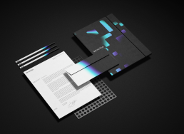
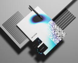
The identity concept leans into the tech and science-heavy nature of the product and company. Stylised as serna.bio, the stern lowercase wordmark instantly identifies the technical propensity of the team behind the brand, while the customised letterforms allude to the structural bonds present in cellular chemistry.
Client
SERNA BIO
Year
2024
Services
Identity designUI designInfographics
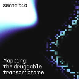
The illustrative visual language is built upon a conceptual framework closely related to RNA research. The nucleotides that form RNA sequences are visualised as abstract tiles, taking visual cues from geometric folk art forms throughout the world. Conjoined and repeated, they form a rich and detailed tapestry, lending an emergent nature to the geometric structures within. The pixel-based visual style orients the identity back towards the world of technology and aligns the visual language with the logotype.
Visualisation of an ‘S’ monogram through a stylised representation of a single stranded RNA helix forms an easily identifiable and intelligible secondary mark. The RNA is represented by the dynamic version of the logomark, where the helical form is revealed in motion.